

1. 理論
2. 学習
2.1. 基本
モデルを宣言し、fitでデータを当てはめます。
当てはめた後のオブジェクト(gmm)が学習後のモデルです。
means_メソッドやbicメソッド、predictを利用して下流の解析に用います。
# libraries
from sklearn import mixture
from sklearn.mixture import GaussianMixture

# data
xy = np.array(res_decomposition.iloc[:, :2])

# fit
gmm = mixture.GaussianMixture(
    n_components = 50,
    covariance_type = 'full', # ['spherical', 'tied', 'diag', 'full']
    n_init = 10,
    reg_covar = 0.1,
    random_state=42
)
gmm.fit(xy)
2.2. BICによるモデル選択
ハイパーパラメータをBICに基づいて選択し、ベストなモデルを返す関数とその実行例は以下です。
def calc_gmm_BICs(
    res_decomposition,
    n_component,
    cv_types = ['spherical', 'tied', 'diag', 'full'],
    reg_covar = 0.1
):
    # to nparray
    xy = np.array(res_decomposition.iloc[:, :2])

    # BIC
    BICs = []
    best_gmm = None
    lowest_bic = np.infty
    lowest_bic_cv_type = ""
    lowest_bic_n_component = 0
    n_components_range = range(1, n_component + 1)
    n_init = 10
    for cv_type in cv_types:
        for n_components in n_components_range:
            gmm = mixture.GaussianMixture(
                n_components = n_components,
                covariance_type = cv_type,
                n_init = n_init,
                reg_covar = reg_covar,
                random_state=42
            )
            gmm.fit(xy)
            BICs.append(gmm.bic(xy))
            if BICs[-1] < lowest_bic:
                lowest_bic = BICs[-1]
                best_gmm = gmm
                lowest_bic_cv_type = cv_type
                lowest_bic_n_component = n_components

    return {
        'best_gmm': best_gmm,
        'BICs': BICs,
        'lowest_bic': lowest_bic,
        'lowest_bic_cv_type': lowest_bic_cv_type,
        'lowest_bic_n_component': lowest_bic_n_component,
        'n_component': n_component,
        'cv_types': cv_types,
        'reg_covar': reg_covar
    }


# PCAとUMAPの各々についてBICを計算
bic_results_pca = calc_gmm_BICs(res_pca, 50)
bic_results_umap = calc_gmm_BICs(res_umap, 50)


# 結果の保存
no = now()
os.makedirs(f'{TEMP_DIR}/best_gmm/{no}')
pickle_save(f'{TEMP_DIR}/best_gmm/{no}/bic_dict_pca.pkl', bic_results_pca)
pickle_save(f'{TEMP_DIR}/best_gmm/{no}/bic_dict_umap.pkl', bic_results_umap)
上記の結果を棒グラフで可視化する関数は以下です。
# library
import itertools
# Plot the BIC scores
def plot_gmm_BICs(bic_results, cv_colors = ['blue', 'green', 'red', 'orange']):
# unpacking
BICs = np.array(bic_results['BICs'])
n_components_range = range(1, bic_results['n_component'] + 1)
cv_types = bic_results['cv_types']
# figure
plt.figure(figsize=(14, 6),dpi=100)
ax = plt.subplot(111)
# bar plot
bars = []
cv_colors_iter = itertools.cycle(cv_colors)
for i, (cv_type, color) in enumerate(zip(cv_types, cv_colors_iter)):
xposes = np.array(n_components_range) + .2 * (i - 2)
bars.append(plt.bar(xposes, BICs[i * len(n_components_range):(i + 1) * len(n_components_range)], width=.2, color=color))
# text (place * near the best model)
xpos = BICs.argmin() % len(n_components_range) + .65 + .2 * BICs.argmin() // len(n_components_range)
plt.text(xpos, BICs.min() * 0.97 + .03 * BICs.max(), '*', fontsize=14)
# layouts
plt.title(f'BIC score per model')
plt.xticks(n_components_range)
ax.set_xlabel('Number of components')
plt.ylim([BICs.min() * 1.01 - .01 * BICs.max(), BICs.max()])
ax.legend([b[0] for b in bars], cv_types)
# shoe
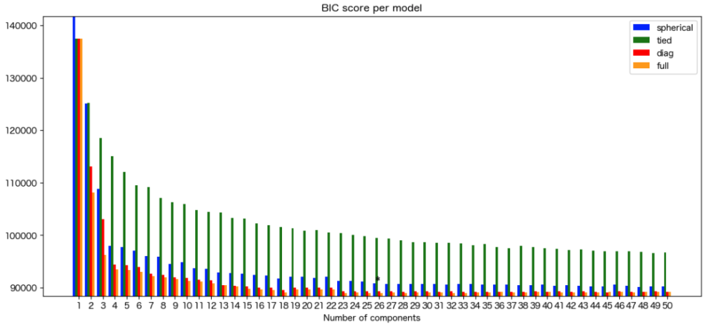
plt.show()上記関数の実施例は以下です。
plot_gmm_BICs(bic_results_pca)
3. 平均・分散・AIC・BIC
# 平均 (各componentの平均)
mean_x = best_gmm.means_[:, 0]
mean_y = best_gmm.means_[:, 1]

# BIC
gmm.bic(xy)
4. 予測
どのcomponentに属するか予測(クラスタリング)
clusters = [i + 1 for i in best_gmm.predict(xy)]
5. 等高線による可視化
関数と実行例は以下です。
def plot_decomposition_with_best_gmm(data, bic_results):
    # to nparray
    xy = np.array(data.iloc[:, :2])

    # unpacking
    best_gmm = bic_results['best_gmm']
    lowest_bic_n_component = bic_results['lowest_bic_n_component']
    lowest_bic_cv_type = bic_results['lowest_bic_cv_type']

    # plot decomsition
    plt.figure(figsize=(14, 10))
    plt.scatter(xy[:, 0], xy[:, 1], s=5, label='Data', color='blue', alpha=0.5)

    # plot cluster centers
    plt.scatter(best_gmm.means_[:, 0], best_gmm.means_[:, 1], marker='o', s=100, label='Means', color='red', edgecolors='black')

    # plot contours
    x_min, x_max = min(xy[:,0]), max(xy[:,0])
    y_min, y_max = min(xy[:,1]), max(xy[:,1])
    x_delta, y_delta = x_max - x_min, y_max - y_min
    x = np.linspace(x_min - 0.05 * x_delta, x_max + 0.05 * x_delta, 100)
    y = np.linspace(y_min - 0.05 * y_delta, y_max + 0.05 * y_delta, 100)
    X_grid, Y_grid = np.meshgrid(x, y)
    Z = -best_gmm.score_samples(np.array([X_grid.ravel(), Y_grid.ravel()]).T)
    Z = Z.reshape(X_grid.shape)
    plt.contour(X_grid, Y_grid, Z, levels=10, linewidths=1, colors='green', linestyles='dashed', alpha=0.5)

    # layout
    plt.xlabel('Axis 1')
    plt.ylabel('Axis 2')
    plt.title(f'Gaussian Mixture Model with {lowest_bic_n_component} components and {lowest_bic_cv_type}')
    plt.legend()
    plt.grid(True)
    plt.show()


plot_decomposition_with_best_gmm(res_pca, bic_results_pca)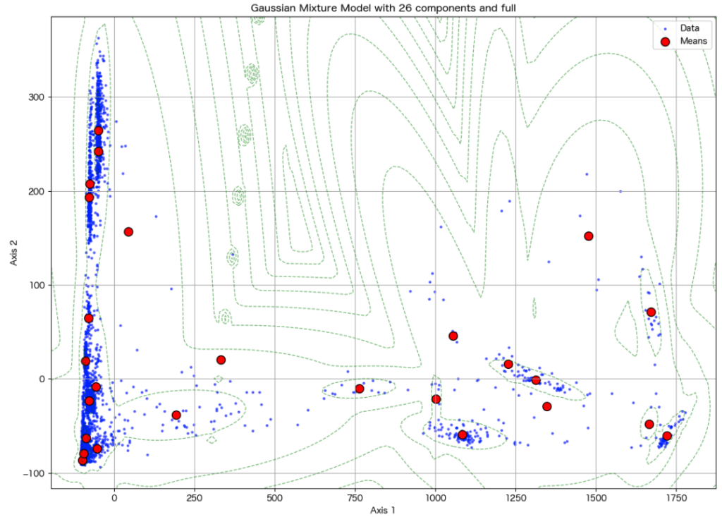


コメント